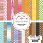
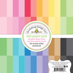
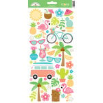
For my page I really wanted to play off the colors and polka-dot pattern in my photos so I ended up pulling papers and embellishments from six different Doodlebug lines to create my layout today.
Here's a full look at the awesome double page sketch that inspired my layout. It originally called for 2 vertical and 4 horizontal photos, but I only had five photos from this day so I switched one photo to an embellishment opportunity where my palm tree is. ;)
The sketch calls for three clusters to form a visual triangle and move the viewers eye through the page, with the title and subtitle forming the third point in the triangle. For my first point, I used a polaroid frame and embellishment from the Fun in The Sun Odds and Ends pack, topped with a mini jewel.
I chose to use the center strip which was originally intended for some longer journaling to hold my over-sized title using a mix of two different styles of alphabet stickers. To add a bit of interest, I mixed two different colors in the same skinny font and layered a sun below the word "sunning".
For my new "journaling" spot I added some simple details about the day along with a cute little scene using some waves paper which I fussy cut out and paired with a flamingo sticker from the new At The Zoo collection.
I hope I've inspired you to mix a few of your favorite Doodlebug collections. It's so much fun to pull from the colors of your photos and letting them guide you in your design process.

Interested in the products I used to create my projects today? To make supplies easier for you to find, I have listed them below (affiliate links included).
Supplies Used (available at Scrapbook.com)


No comments:
Post a Comment