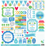
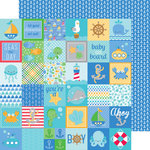
For this layout I turned to my favorite Achors Aweigh collection by Doodlebug. It was a perfect compliment to some fun photos I had been holding onto from a couple summers ago and I love that I was able to take what might be considered a "boy" themed collection and make it work for a layout all about girls.
I created a graphic feel to my title by evenly spacing all my letters and distinguishing the two words with a change in color. I was able to continue that look with a simple journaling block that had the corners rounded on one side and bled off the edge.
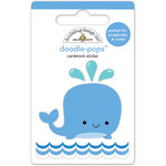
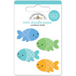
I completed my visual triangle with three embellished circles, varying the size to keep things interesting. I don't know about you, but I can't help but smile back at those fish and whale doodle pops.
Here's a look at the original sketch that inspired my page. I made some minor alterations by rotating the journaling onto its side and slightly playing with size and position of the three embellishments to work with my photos. I love how sketches allow me to have a plan in place to make the most of my scrapbooking time (which sadly is very limited these days).
I hope I've inspired you to print out some of your favorite summer photos and document them this month. Thanks so much for stopping by. :)

Interested in the products I used to create my projects today? To make supplies easier for you to find, I have listed them below (affiliate links included).
Supplies Used (available at Scrapbook.com)







What a fabulous layout! Love your creations and love Doodlebug!
ReplyDeleteThank you Eileen. I always appreciate your sweet comments. :)
Delete