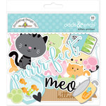
Hi there! I'm popping in today with a Doodlebug scrapbook page made almost entirely with the Odds and Ends pack and some of my favorite tone-on-tone papers from the Kitten Smitten collection.
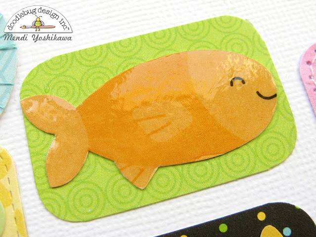
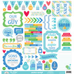
I adore all the die-cuts that comes in the Doodlebug Odds & Ends packs. They are stuffed full of so many darling pieces perfect for embellishing your projects. For my layout today, I thought it would be fun to take my die-cuts to the next level by adding some special touches to each of them.
Embellishment Opportunity #1: Add Glossy Accents by Ranger over the top of a die-cut after it's been adhered to your page for a bit of shine (just make sure you can set your project aside afterward so you don't run a sleeve through it before it's had time to dry). ;)
Embellishment Opportunity #2: Wrap the die-cuts with thread or baker's twine to add extra texture and a touch of realism (or as an alternative, stitch around them on your sewing machine).
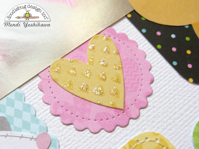
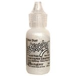
Embellishment Opportunity #3: Add a touch of glitter using Stickles glitter glue or by adding some liquid adhesive and sprinkling with Doodlebug's Sugar Coating Glitter.
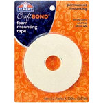
Embellishment Opportunity #4: Pop up die-cuts with foam tape to add extra depth to your project and create interest with the shadows.
I hope I've inspired you to take a closer look at these amazing die-cut packs. They really have so many fun possibilities!

Interested in the products I used to create my projects today? To make supplies easier for you to find, I have listed them below (affiliate links included).
Supplies Used (available at Scrapbook.com)
Hello there! I hope you are enjoying your summer so far. Today I'm over on the Doodlebug blog, sharing a closer look at a layout I created for Becky Fleck's July PageMaps sketch reveal using a mix of some of my favorite collections for summer.
For my page I really wanted to play off the colors and polka-dot pattern in my photos so I ended up pulling papers and embellishments from six different Doodlebug lines to create my layout today.
Here's a full look at the awesome double page sketch that inspired my layout. It originally called for 2 vertical and 4 horizontal photos, but I only had five photos from this day so I switched one photo to an embellishment opportunity where my palm tree is. ;)
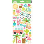
The sketch calls for three clusters to form a visual triangle and move the viewers eye through the page, with the title and subtitle forming the third point in the triangle. For my first point, I used a polaroid frame and embellishment from the Fun in The Sun Odds and Ends pack, topped with a mini jewel.
I chose to use the center strip which was originally intended for some longer journaling to hold my over-sized title using a mix of two different styles of alphabet stickers. To add a bit of interest, I mixed two different colors in the same skinny font and layered a sun below the word "sunning".
For my new "journaling" spot I added some simple details about the day along with a cute little scene using some waves paper which I fussy cut out and paired with a flamingo sticker from the new At The Zoo collection.
I hope I've inspired you to mix a few of your favorite Doodlebug collections. It's so much fun to pull from the colors of your photos and letting them guide you in your design process.
 Interested in the products I used to create my projects today? To make supplies easier for you to find, I have listed them below (affiliate links included).
Supplies Used (available at Scrapbook.com)
Hello there! I hope you're having a fabulous week. The Doodlebug team paired up with PageMaps earlier this month so I thought I would pop in with another summer layout using a PageMaps Sketch as inspiration (shared below).
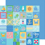
For this layout I turned to my favorite Achors Aweigh collection by Doodlebug. It was a perfect compliment to some fun photos I had been holding onto from a couple summers ago and I love that I was able to take what might be considered a "boy" themed collection and make it work for a layout all about girls.
I created a graphic feel to my title by evenly spacing all my letters and distinguishing the two words with a change in color. I was able to continue that look with a simple journaling block that had the corners rounded on one side and bled off the edge.
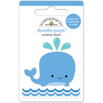
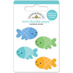
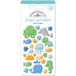
I completed my visual triangle with three embellished circles, varying the size to keep things interesting. I don't know about you, but I can't help but smile back at those fish and whale doodle pops.
Here's a look at the original sketch that inspired my page. I made some minor alterations by rotating the journaling onto its side and slightly playing with size and position of the three embellishments to work with my photos. I love how sketches allow me to have a plan in place to make the most of my scrapbooking time (which sadly is very limited these days).
I hope I've inspired you to print out some of your favorite summer photos and document them this month. Thanks so much for stopping by. :)

Interested in the products I used to create my projects today? To make supplies easier for you to find, I have listed them below (affiliate links included).
Supplies Used (available at Scrapbook.com)


