Friday, August 31, 2012

Jillibean Soup Layouts and Cards

Happy Friday! 

Today I am getting my Jillibean Soup Design Team entry sent off so in celebration of that I am sharing some additional layouts and cards I made using their yummy papers! 

This layout was created with their soft and sweet Southern Chicken Dumpling Soup collection.  The word "perfect" and the circle border were cut out on my Silhouette Cameo and I used a wonderful sketch by Valerie Salmon at Got Sketch?

 For this one I had fun playing with their bright and happy Coconut Lime Soup Collection...

I painted some of the kool kraft corrugated alphas red to match (they made red, but I didn't have them on hand) and diecut the word appetit on my silhouette.

I cut the strawberries and limes from the patterned papers and gave the strawberries a little shine by using some glossy accents over the top of them.


Here's an early Christmas Card using Jillibean Soup's Christmas Eve Chowder collection from last year... It's never to early to get a head start on Christmas.  ;)

This is a another 2-page birthday layout  I did using Homemade 6 Bean Soup (mixed in with a few "B" side prints from some of their other lines).  There were some funky weird colors in some of my photos (the lighting was bad) and this line magically pulled them all together.  :)

The 4 Owl Set, banners, bracket shape and LW Happy font were all designed by Lori Whitlock for the Silhouette Store...  Jillibean also recently introduced their adorable Silhouette owl files seen here.  ;)


For this last one I used the Unity/Jillibean Stamps and Paper from the Watermelon Gazpacho Soup collection (and small aqua dot from the 6x6 Apple Cheddar Soup paper pad).  :)

I have a couple more cards, but I am submitting them for publication so I can't share them just yet.  ;)
 
Make sure to check out all the daily inspiration and fun sneak peaks shared at Jillibean Soup's blog found here.
 
Since my family has been sorely neglected this month with all of my mad crafting and it's my Birthday, Labor Day and our first day of school coming on Tuesday, I will be taking a one week break from posting on my blog. I'll be back soon with hopefully some good news and fun things to share.  :)
 
I hope you guys have a fabulous 3-day weekend!!!

Wednesday, August 29, 2012

Another Bella Blvd. Baby Girl Layout...

Hey there!

I had one last layout that was almost done that I didn't get to include in yesterday's Bella Blvd. post yesterday...

I had this one half done for over two weeks now and I just couldn't figure out how to finish it, but I forced myself to push through my creative block and I got it done today.  Yipee!  :)

My layout started with this wonderful giraffe print patterned paper.  I was ecstatic to come across this undocumented photo of my daughter as a baby that matches this paper so perfectly!  I thought it would be fun to make a pleated border with it, using my Martha Stewart score board to help make the folds.

I got hung up on the journaling and the entire right side of the layout. I wanted to use this pink journaling card (I sort of challenged myself to use literally every last cutout on that sheet between the three layouts and 5 cards I made), but it had numbers running down the side that didn't really correlate with what I wanted to say. Then it hit me! I could cover them up with some circle and heart punches! Yay! :)  

I also felt like the layout was bare at the top to the right of the baby girl title, but the word pennants cut from the border strips ended up being a good solution for that.


I thought it would be fun to use the darling tan elephant cutout that perfectly matched my pink and brown color scheme.  For the longest time I had him on the layout all by himself down in the corner, but today I decided to cut out the pink one from a border strip.  After moving the small pink elephant all over the page (originally thought the little guy could fill that bare spot at the top) I realized he would make the perfect baby to the bigger elephant.  Duh!  I don't know what took me so long to figure this out.  When I placed him down there it felt like things were finally falling into place.  :)

Well, there ya have it.  Sometimes it just takes a lot of fussing around with things before they fall into place.  ;)
 
Thanks so much for stopping by.

Tuesday, August 28, 2012

Bella Blvd. Baby Girl Cards & Layouts

Hi there!
I thought in honor of getting my Bella Blvd design team submission completed and sent off that I would post some extra cards and layouts I made this past month using their products.

I made this card a couple weeks ago using Bella's older "Midterm" collection and a sketch by Allison Davis over at Sketch Support.  It was our youth pastor's 50th birthday and the sentiment by Papertrey Ink fit him perfectly!  :)

 Inside the Card:

While I was waiting (and waiting) to receive my online order for Bella Blvd's newest collections, I had a lot of extra time to play with Bella Blvd's adorable Baby Girl collection which I already had on hand...

In addition to a baby girl layout I submitted, I made a baby's first birthday layout...

And several quick cards to have on hand with my scraps...


I actually had a bit of a mishap with this last teddy bear card.  I had pretty much finished the card when I decided it would be cute to add some black enamel dots for the eyes, but to my horror the dot turned into a mess.  Rather than throw out the whole card, I decided to rescue it with some googly eyes.  Still bummed, but it works...  ;)
 
I also made this birthday layout to serve as a second page compliment to another Birthday Girl layout I submitted.  I had fun playing with their new washi tapes which I used to make my own party hat.  I was excited to discover the collection name "Birthday Girl" that you cut off of all the 12x12 sheets made the perfect little pennant to add to my layout.    
 

This is such a fun and happy collection to play with!  When I get a little more time, I'm hoping to whip up a stack of birthday cards.

Thanks so much for stopping by and make sure to check out Bella Blvd's blog for some awesome inspiration using their latest collections. 

Cross your fingers for me!  :)


Friday, August 24, 2012

Cosmo Cricket's Garden Variety Farm Themed Cards

Happy Friday!!! 

Today I have a couple more cards to share that I made almost a year ago for yet another Craft Warehouse Stamp Club challenge.  ;)  The first one was for the official challenge which had us using the clear acrylic element (by Tim Holtz I think), a teal note card, jute twine and a "farm" theme. Let me just say that this was one of the hardest challenges they've ever given us.  The clear tile and the teal color just didn't seem to go with the jute and farm theme...

With that said, I knew I wanted to use Cosmo Cricket's Garden Variety Collection and the matching stamps by Unity that I had never been cut into or seen ink before.  I can't tell you how much of this paper I bought (and bought).  I couldn't get enough of the happy colors and cute little faces on the vegetables.  Too bad I don't garden because I have no idea how I'm ever going to actually make a dent in what I bought.  :)

 
I was having so much fun with the stamps and paper that I decided to go ahead and make another card.  Unfortunately my hubby has zero appreciation for cards so I have no clue who I thought I was making this for.  LOL!  :)

Supplies Used:
Patterned Paper- Cosmo Cricket Garden Variety
Cardstock- Bazzill Basics (red), Neenah Solar White
Farm Stamps- Unity Garden Variety
Cloud Stamps- Papertrey Ink Up, Up & Away
Gingham Background Stamp- Impression Obsession
Gingham Ribbon- American Crafts
Red Twine- American Crafts
Ric Rac- May Arts
Grass Border Punch- Martha Stewart
Scalloped Border Punch- EK Success
Heart Die- Sizzix Sizzlits
Ink-Versafine Onyx Black & Satin Red,
Colorbox Frost White Pigment & Chalk Queues
Ranger White Enamel Accents (for tomato's eyes)
Button- Making Memories

Thanks for stopping by!  :)

Thursday, August 23, 2012

Hero Arts Enjoy the Ride Bicycle Card

Hey there!

Are you guys enjoying your Thursday?  There's something so magical about Thursday's knowing that Friday is right around the corner.  :)


My card today is yet another one I created for a past Craft Warehouse stamp club challenge.  For this one they gave us the B&W circle print ribbon and asked us to incorporate a round theme into our card.  Well, I took their request fully to heart and used layers of scallops, a circle frame and a bicycle stamp repeating the circle motif in the wheels.  :)

Supplies Used:
Patterned Paper- Bo Bunny
White Cardstock- Neenah Solar White
Black Cardstock- Craft Supply
Bicycle Stamp- Hero Arts
Sentiment Stamp- Papertrey Ink
Circle Dies- Spellbinders
Scallop Punch- EK Success
Flower- Prima
Brad- Making Memories
Markers- Copic
Ink- Colorbox Frost White


Thanks so much for dropping by! 

Wednesday, August 22, 2012

A Jillibean Soup Thank you Card

Hey there!

Last night I created this card for a couple reasons.  One was that I wanted to play along with Jen Gallacher's back-to-school blog event challenging us to make a project for our children's teachers.  The second thing that had me excited was the new Jillibean Soup shapes over at the Silhouette store.  I am crazy about both and couldn't wait to try them out!  :)

 
I made this card using Jillibean's Sweet and Sour Soup collection with the 6x6 mini pad.  The typewriter was one of the new diecuts available and the labels were a print and cut file which I had a lot of fun with.  I wanted to turn them on their sides and use them as pennants for my sentiment, but some of them had words on them which I figured out I could take away by using the "ungroup" feature on the Silhouette (LOVE that).  I also wanted them all similar in thickness and by printing them myself I had the option to enlarge some to be longer so they would also be thicker.  Yay!!!

The typewriter keys spelling out "thanks" were taken from this 6x6 patterned paper and punched out with a 1/2" circle punch. 

 
Supplies Used:
Kraft Cardstock- Bazzill Basics
Red Cardstock- DCWAV
Patterned Paper- Jillibean Soup Sweet & Sour 6x6 pad
Typewriter diecut- Jillibean Soup for Silhouette Cameo
Pennants/labels- Jillibean Soup for Silhouette Cameo
Sentiment Stamp- Lawn Fawn "Just My Type"
Ink- Versafine Vintage Sepia & Colorbox Chalk Ink Queues
Circle Punch- EK Success
Other- Thread/Sewing Machine
 
Thanks for stopping by!  :)


Tuesday, August 21, 2012

A Neutral "Beautiful Butterflies" Card

Hello!

Today's share is a more neutral take on a butterfly card...  In fact I made this for Craft Warehouse's stamp club and the challenge was to go neutral (they supplied the Studio Calico chipboard butterfly and jute twine).  I am usually all about bright (and more bright), but I had a lot of fun stretching outside of my comfort zone on this one.


I used some of the neutrals from Echo Park's For the Record mini 6x6 pad and stamped the background with the Beautiful Butterflies stamps (and sentiment) by Papertrey Ink.  I didn't have the black rhinestones I had in mind so I colored clear ones using a black copic marker.

Supplies Used:
Patterned Paper-Echo Park For the Record 6x6 Pad
Stamps- Papertrey Ink Beautiful Butterflies
Ink- Versafine "Onyx Black", Ranger Adirondack "Latte"
Chalk Ink- Colorbox "Creamy Brown"
Rhinestones- Kaiser Craft
Pen- Copic Marker "black"
Other: Thread, jute twine

Thanks for peeking!  :)

Monday, August 20, 2012

A Basic Grey & Hero Arts Butterfly Card

Happy Monday!  :)

Did you have a great weekend?  We enjoyed some time with family visiting and last night I happily discovered a patch of wild blackberries in the field next to us.  I had so much fun picking and eating.  I'm hoping to go again this evening so I can get enough to make some blackberry milkshakes.  Mmm...

So this week I thought I would share some cards that I've made in recent months that I never got around to sharing. 


This is a card I made using a Hero Arts Butterfly Stamp, my copic markers and a mini 6x6 paper pad from Basic Grey's Green at Heart collection.  I started by selecting my papers and coloring my butterfly to match.  I stamped and colored two images--Diecutting one with the spellbinders label and fussy cutting the second one out and gluing just the center portion down which all allows the wings to flap a bit to reveal the other butterfly below.  

For the butterfly that was stamped on the diecut label, after coloring the image with the pens, I stamped and cut a mask to cover the butterfly and then used distress inks with a foam applicator to give the label a soft background which blended better with the papers than the stark white cardstock it was originially stamped on.


Supplies Used:
Patterned Paper-Basic Grey Green At Heart 6x6 pad
White Cardstock- Neenah Solar White
Butterfly Stamp- Hero Arts
Sentiment Stamp- Papertrey Ink "Butterfly Dreams"
Border Punch- Martha Stewart
label die- Spellbinders
Ink- Distress Ink, Versafine Onyx Black (sentiment)
Rhinestones- Kaiser Craft
Ribbon-Craft Supply
Other: Copic Markers

Thanks for stopping by!  :)

Friday, August 17, 2012

A Teresa Collins Double Page Layout

Happy Friday!!!

If you are here for the Papertrey Ink Make-it-Monday challenge please scroll down or click here.  :)

I was originally going to continue my blast from the past and share a couple more older layouts today, but I finally got around to taking pictures of some of my newer layouts yesterday and I can't resist the urge to share newer pages instead.  Continuing with my double page layout theme this week, this is one I created for yet another Craft Warehouse Scrapbook Club challenge... :)


For this challenge we were given a sheet of the yellow cardstock, a half sheet of the double-sided striped paper, the navy brad and a brighter blue diecut circle (it was too light for my layout so I inked it up and layered it under the yellow brad for my flower).  The only requirements are that we asked to use a little bit of everything they give us and then when we come back the following month we share them with the group and get a mini prize for participating.  :)

I have sort of been hoarding these favorite pictures of my daughter for a couple years now waiting for the right product to come by that would inspire me to finally dig in and scrapbook them.  Well it turns out Teresa Collins Everyday Moments (mixed with a bit of the yellow prints her Carlina Breeze 6x6 pad) was just was I was looking for!


I cut the title, scalloped circle and damask print out on my Silhouette.  The damask design by Lori Whitlock was a single "section" and using the duplicate feature, I made three and lined them up so that they were touching.  I then used the weld function to make them cut out as one connected piece.  I had never cut this shape before and I really like how it turned out!  :)


Supplies Used:
Patterned Paper- Teresa Collins
Cardstock- Bazzill Basics (Navy, White), DCWAV (yellow)
Brads- Making Memories (Yellow Epoxy), American Crafts (Glitter), Teresa Collins (navy epoxy)
Flowers- Bazzill Basics
Tab Die- My Favorite Things Die-namics
Ribbon- Pebbles
Border Punches- EK Success
Colorbox Fluid Chalk Ink

Hope you all have a great weekend and thanks so much for stopping by!  :)

Thursday, August 16, 2012

An Echo Park 2-page Birthday Girl Layout

Hi there!

For the Papertrey Ink Make-it-Monday challenge, please scroll down...

I'm back today to share another 12x12 layout that I made this Spring for my daughter's Sixth Birthday.  I don't know about you, but kid's birthdays are usually super hard for me to squeeze onto a single page.  In fact there was a time where I took sooo many photos that I felt the need to create 3 or 4 double page layouts, but I've gotten lazy in that department over the years.  ;)

For this one I turned to one of my all time favorite Echo Park collections called "Summer Days" designed by the amazing Lori Whitlock. I just adore the fun, bright prints. I also utilized a cool sketch by Valerie Salmon at Got Sketch?

The Six circles in the sketch were the perfect place for me to have some fun diecutting various birthday icons on my Silhouette and showcase so many of my favorite prints from the the collection.  I can never get enough of the tone-on-tone prints so I love that every piece has that wonderful B side.  


I then tried to add some details by adding glossy accents to the cake frosting, candle flame and Balloon.  Sparkly brads, buttons and bakers twine were also thrown in for fun.  I hope this will inspire you to try your hand at making some of your own handmade embellishments! 

Thanks so much for stopping by!  :)

Papertrey Ink's Make-it-Monday Challenge #78

Hey there!

I have been having so much fun playing with Bella Blvd's baby girl collection that when I saw this week's Make-it-Monday video by Heather challenging us to incorporate hand stitching around Papertrey ink stamps I just had to join in.  There is this pink giraffe print paper in the collection that I thought would go so well with this darling giraffe found in Papertrey Ink's Sweet Baby set. 


I decided to go with Pink and Brown for my color scheme (the brown polka dot print is from Bella Blvd's Finally Fall collection).  Years ago Gymboree had a pink and brown giraffe line that I loved so I took my inspiration from them.  I love the way the stitching around the giraffe gives it the look of applique like you would find on one of their cute shirts.  I completely lucked out finding the brown ribbon with the pink stitches in my craft supply--And to have the pinks and browns actually match perfectly... Let's just say it was my lucky day.

Additional Supplies:
Cardstock- Bazzill Basics
Button- Doodlebug
Colorbox Doodlebug Cupcake Pigment Ink
We R Memory Keeper Corner Chomper

Make sure to check out all the cool new things that just came out with Papertrey Ink's new releases here and all the great takes on this challenge here.

Thanks for stopping by!  :)

Wednesday, August 15, 2012

A "Top Ten" 2-page Layout

Hey there!

Today I thought I would mix it up a bit and share a recent (gasp) double page layout.  I made this one for the Vancouver Craft Warehouse Scrapbook Club challenge.  They gave us a half sheet of 12x12 patterned paper from My Mind's Eye's Indie Chic collection and a sheet of pale yellow Bazzill cardstock and we were challenged to create a layout with it.


I had these photos from our Japan trip that we took 3 years ago and since we were going again this summer I thought it was about time that I finally get around to finishing this layout that I had printed the photos, picked out the sketch and typed up the journaling for way back when.


I LOVE My Mind's Eye, but the paper they challenged us with this month was my least favorite from the entire collection.  Lucky for me the pattern had these teal colored flowers that I could fussy cut out and mix with one of my favorite color groupings from the collection!  The rest of the layout was created using 4 patterns from only two sheets of doubled side paper.  I was patting myself on the back for that one considering it was a 2-page layout and I have a tendency to buy every paper in a collection.  I also was able to use the matching buttons that I won on Jennifer McGuire's blog the month before.  :D


Thanks again for stopping by!  :)

Tuesday, August 14, 2012

2 Spring & Summer Double Page Layouts

Hi there!

Thanks for bearing with me through all these old shares. I am in the process of trying to put together entries for both Jillibean Soup and Bella Blvd's Design Team Calls. I am making a few extra projects using their products that I hope to share on my blog here very soon. :)  In the meantime I have two more double page layouts to share with you today...

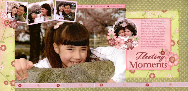
This first layout is one I made ages ago for the 2-page category at Pagemaps 2nd Anniversary Sketch Challenge (I think they celebrated their 6th anniversary this year if that tells you anything). I love how this sketch called for a larger than life photo (10x14). The flowers were diecut on my Silhouette to match the patterned paper and then embellished with my favorite Signo Uniball white gel pen.


For the second one I again turned to a Pagemaps sketch, this time using Fancy's Pants Key Lime Pie Paper and Rub-ons (another one of those collections that I couldn't wait to get my hands on--I still adore the bright colors and soft prints).

Thanks for stopping by!  :)

Related Posts Plugin for WordPress, Blogger...