Thursday, September 22, 2016

Doodlebug Boos & Brews Halloween Layout with Pink

Hello there!  I'm so excited to be sharing some ideas using one of my favorite Doodlebug collections for Halloween yet called Boos & Brews.  I don't know how they do it, but Doodlebug manages to top themselves year after year!

I love how this collection includes the aqua and I knew I had another set of photos from a past Halloween just waiting for the right collection.  To help make it a perfect match I also mixed in some of the new petite prints in bubblegum to pick up the hot pink in my daughter's costume.


Doodlebug Design Boos & Brews Halloween Layout using Pink by Mendi Yoshikawa

As a way to include lots of the fun embellishments from the collection I decided to create a circle border down the left side of my layout.  It gives my page the pop of color I was after and also grounds each of the stickers, die-cuts and sprinkles.


Doodlebug Design Boos & Brews Halloween Layout using Pink by Mendi Yoshikawa


I wanted to stitch around each of my circles, but I knew it might be hard to maneuver my page around the arm of my machine once they were adhered so I chose to stitch and then adhere them.  


As I was creating I discovered the new eerie eyes shape sprinkles looked super cute layered over eyes of the critter stickers and die-cuts to add another layer of dimension.


Doodlebug Design Boos & Brews Halloween Layout using Pink by Mendi Yoshikawa


I finished off my layout with a custom title die-cut on my Silhouette and paired with my favorite Love Letter Alphabet stickers.


I hope I've inspired you when scrapbooking girls at Halloween and making a collection work for you when you don't have just the right colors to match your costumes.


Interested in the products I used to create my projects today?  To make supplies easier for you to find, I have listed them below (affiliate links included). 

Supplies Used (available at Scrapbook.com)

Monday, September 19, 2016

Lawn Fawn Thank You & Birthday Window Cards

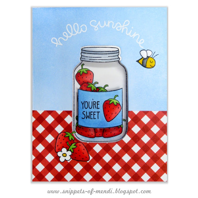
Hello there!  I have been so busy preparing the holiday release for Sunny Studio that I nearly forgot to share these cards featured in the summer issue of CardMaker Magazine.  They were created for a feature on Window cards.  


Lawn Fawn Summertime Charm Strawberry Jar Window Card by Mendi Yoshikawa


Lawn Fawn Fintastic Friends Window Card by Mendi Yoshikawa


Interactive cards seem to be all the rage these days and this is one more fun way to make the inside work together with the outside.   To see the insides, supply lists and read how these were created make sure to pick up the summer issue of CardMaker Magazine from their online store. ;)

Tuesday, September 13, 2016

Doodlebug Design Flea Market Fall Scrapbook Layouts

Hello there!  I'm popping in with a couple of layouts I'm sharing on the Doodlebug blog today using the darling new Flea Market collection.  There are so many fun images and great ways to use this line, that I was having a really hard time deciding which direction to go with my project.  To solve my internal struggle, I decided to create two layouts with pretty different looks.

For my first layout I wanted to focus on all the happy sunflower images in the collection and pull them together to compliment some photos of mine from a couple years ago.

Doodlebug Design Flea Market Fall Sunflower Scrapbook Layout by Mendi Yoshikawa

I wanted to find a way to incorporate the sunflower paper, but I also wanted to make sure it didn't overpower my page and become too busy.  To achieve a balance, I used it in smaller border strips along the top and bottom which I think is a great solution for those who love the A side of papers, but then struggle to actually use them.  

For my blue woodgrain background I utilized the "Our Happy Place" paper that's perfect for framing as a home decor piece and carefully covered the images in the center with my photos and journaling card.

Doodlebug Design Flea Market Fall Sunflower Scrapbook Layout by Mendi Yoshikawa

When my layout was nearly finished I felt like it needed a little extra bling to bring it to life so I added Glossy Accents to all the polka-dots in the center of each sunflower die-cut. It's so easy to do and I think it added some great texture to my finished page.

Doodlebug Design Flea Market Fall Sunflower Scrapbook Layout by Mendi Yoshikawa

For my second layout I wanted to create something that was really different from my first page, but still have the two pages share an element so that they would compliment each other in my album.   To achieve this I chose to use the Barnwood paper as my background on both.

Doodlebug Design Flea Market Fall Pumpkin Patch Scrapbook Layout by Mendi Yoshikawa

To create the banner ends for each of my three strips I used the two Fishtail Banner die sets I designed for Sunny Studio.  These dies can create banners in a variety of sizes up to 4.25" wide and were just what I needed for the PageMaps sketch that inspired my layout.

Doodlebug Design Flea Market Fall Pumpkin Patch Scrapbook Layout by Mendi Yoshikawa

I had so much fun using all the awesome new cutouts, stickers and sprinkles from the collection to create three embellishment groupings for each of my banner strips.


The new Labels and Tags sets that Doodlebug is releasing with each of their new collections are perfect for recording your journaling and extra details on.  I love how the matte surface is so well suited for printers too!

Doodlebug Design Flea Market Fall Pumpkin Patch Scrapbook Layout by Mendi Yoshikawa

Thanks so much for stopping by.  I hope you will come back each day to see all the fabulous ideas the team is sharing with this wonderful new collection! 


Interested in the products I used to create my projects today?  To make supplies easier for you to find, I have listed them below (affiliate links included). 

Supplies Used (available at Scrapbook.com)

Related Posts Plugin for WordPress, Blogger...